
Have you ever seen a chart that feels like it tells the story of our warming planet? Climate change graphs cram years of data into neat pictures that show how temperature records keep getting higher. In 2023, global temperatures rose a lot, and by 2024, the numbers climbed even more. This post uses easy-to-read graphs to lay out these surprising trends and explain what they mean for our world. Stay with us to discover how these figures help us see the changes in our climate and hint at what might come next.
Essential Climate Change Graphs and Trends
Climate change graphs let us see long-term trends in our warming planet. They pack decades of data into a simple picture that shows how our Earth is changing over time. When you check out a global climate graph, you quickly spot shifts that hint at big changes. For example, in 2023 the average global temperature was about 1.62 °C above what it was in 1850-1900, and 2024 broke records with even higher numbers.
Take 2024 for instance, it turned out to be the warmest year ever recorded by thermometers, with land temperatures climbing over 2.28 °C above the baseline. These facts show just how fast our planet is heating up.
| Graph Type | Time Period | Data Source | Key Insight |
|---|---|---|---|
| Global Mean Temperature Anomaly | 1850–2024 | Berkeley Earth | Long-term warming trend |
| Land Temperature Anomaly | 1850–2024 | Berkeley Earth | Land warms faster than oceans |
| Ocean Surface Temperature | 1850–2024 | Berkeley Earth | Marine heat increase |
| CO₂ Concentration Trend | 1960–2024 | NOAA | CO₂ rise vs temperature |
| Sea Level Rise | 1880–2024 | NASA | Impact of melting ice |
When you read these charts, start by looking at the anomaly axes. These axes show how much a measurement differs from a historical average (usually based on 1850–1900 data). In simple terms, an anomaly is the difference between what we see now and what was normal before. You’ll also see shaded bands around trend lines, these give a hint about how accurate the data is. A narrow band means the numbers are very reliable, while a wider band shows there might be more ups and downs. For example, a reading of 1.62 ± 0.06 °C tells you the true number is likely very close to 1.62 °C. This way of presenting data helps build trust in the trends we see and deepens our understanding of what's happening to our planet.
Analyzing Global Temperature Trends

Have you ever wondered why we track temperature anomalies? They show us how much today's temperatures differ from what was normal in the past. By keeping an eye on these changes, we can spot both quick shifts and longer trends. This helps us see how nature and our own actions mix to shape the climate. For example, a steady rise in temperatures is detailed in monthly variations, revealing record highs and unexpected warm spells.
- 2023 global mean: +1.62 °C
- 2024 land mean: +2.28 °C
- 2024 ocean mean: +1.15 °C
- Six straight months of record highs (Jan–Jun 2024)
Line graphs and bar charts tell this story in different ways. Line graphs smooth out the bumps, offering a clear look at long-term warming trends. Bar charts break things down month by month, which makes sudden changes, like an unusual warm spell in the North Atlantic stretching from summer 2023 into 2024, stand out. So whether you pick one or the other really depends on if you're interested in the big picture or the fine details.
Monthly and Seasonal Temperature Variations
At the end of 2023, El Niño hit its peak and made things feel warmer right from the start. Its warm touch lasted until June 2024, and as it faded away, a mild La Niña popped up in January 2025. This La Niña hinted that the weather might cool off a bit for a short time.
During 2024, every month was at least 1.5 °C warmer than usual. That steady difference makes it pretty easy to spot the monthly changes in the climate. When you look at graphs that plot these temperatures, you really see how natural cycles and things we do mix together to create each season’s weather. They clearly show not only the overall warming but also how the temperature shifts from month to month.
Here are some key points:
| Detail | Description |
|---|---|
| Record months | January to June 2024 |
| Highest anomaly month | For example, April 2024 reached +2.3 °C |
| Difference analyzed | Between winter and summer anomalies |
When picking a style to show this data, you could use a color-coded heat map to see the gradual changes as the months pass. Or, if you prefer, a scatter-plot lays out the numbers as clear, separate points. Both ways help us understand how seasonal trends go up and down over time.
Regional Temperature Distribution Maps
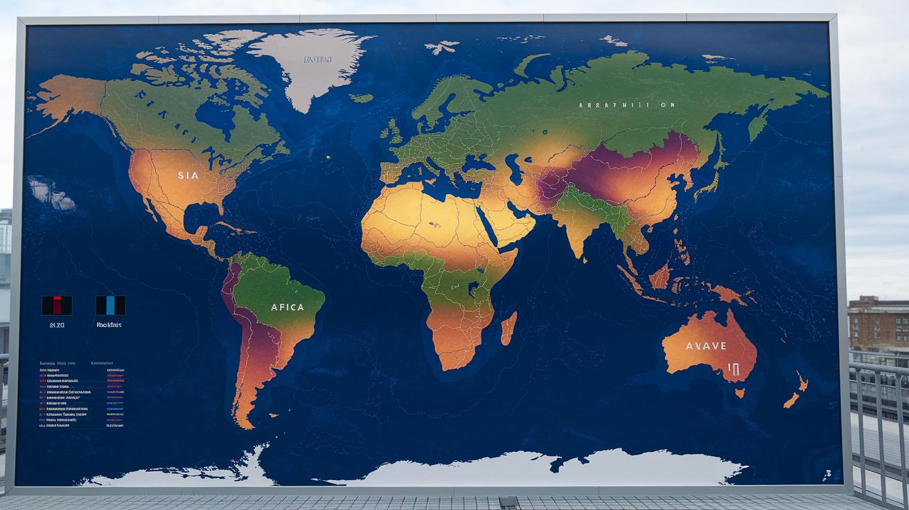
Maps are handy tools that let us quickly see which parts of our planet are heating up the most. When you check out a temperature distribution map, you'll notice some areas look noticeably warmer than others. For instance, a map from 2024 shows that certain regions are a few degrees above the average from 1951 to 1980, making it clear which spots are experiencing big changes.
Here are some regions highlighted on these maps:
- Asia
- Africa
- North America
- South America
- Atlantic regions
- North Pacific
- Southern Ocean
The trick to understanding these maps is looking at how the legend and grid details are set up. Think of the legend as a key that explains the colors, each color shows a different range of temperature differences. And the grid resolution, which is like how clear a high-definition photo is compared to a blurry one, tells you how detailed the map is. With these clues in hand, it's much easier to spot where the most warming is happening and see the subtle shifts in the data.
Visualizing Greenhouse Gas Emissions Trends
Carbon dioxide graphs are key to how we understand the impact of our human activities on the earth's energy. They give us a simple look at what has happened in the past and what is happening now, letting us get a clear view of our future. These charts turn complex climate numbers into visuals anyone can understand. When we see how CO₂ levels have climbed over time, it really hits home why cutting emissions is so urgent. That’s why these graphs help shape policies and spur actions to fight climate change.
- Budget to keep warming at 1.5 °C: fewer than 10 years
- Budget to keep warming at 2 °C: fewer than 30 years
- Historical rise of CO₂ levels (by decade)
Two-axis graphs are especially handy when they mix CO₂ measurements (in parts per million, which tells you how many CO₂ molecules are in a million particles) with shifts in temperature. This style lets us look at two related sets of data right side by side. One scale tracks the slow increase of greenhouse gases, and the other shows how temperatures have shifted from a known past average. This makes it easy to notice how rising emissions are linked with warming trends. It’s clear from these charts that even the slightest uptick in emissions can lead to noticeable changes in our climate, reminding us of the fine balance between what we put into the environment and the changes we feel in return.
Data Sources and Interactive Climate Graph Tools

Every good interactive climate graph starts with solid data. Trusted institutions collect heaps of climate observations to make sure these charts show accurate and clear information. Take Berkeley Earth, for example. They gather an impressive 22 million monthly readings from more than 50,000 weather stations, with 18,447 of those stations actively collecting data and around 186,000 readings each month for 2024. This rich data pool, along with insights from other respected centers, forms the backbone for creating lively and understandable climate change visuals.
- Berkeley Earth (22 M observations)
- NASA GISTEMP
- NOAA GlobalTemp
- UK HadCRUT
- ECMWF reanalysis
These sources offer more than just data, they give you flexible ways to dive into it. You can download custom datasets for closer examination, and many even support API access (tools that let developers fetch the latest info directly). Plus, you can easily embed high-resolution SVG or PNG charts (clear digital images) into websites, turning complex data into engaging visual stories that everyone can enjoy.
Future Climate Projections and Forecast Graphs
We use groups of climate models, like CMIP6, to look ahead and see what might happen. Putting many model predictions together gives us a better idea of how our actions might change the climate. Even though the weather can go up and down, the long-term trend still shows a warming world.
Here are some key points from the latest graphs:
- 2025 projected rank (the third warmest)
- Expected anomaly range (+1.4 to +1.8 °C)
- A look at RCP2.6 compared to RCP8.5 scenarios
When you check these charts, notice the shaded areas. They show how sure we are about the numbers. Narrower bands mean the models agree closely on future trends, while wider bands highlight more differences among the forecasts. By looking at the range from many models, you can see how different ideas about emissions and energy use might affect warming. This approach not only builds trust in what the models are saying but also shows how climate policies can really make a difference over time.
Final Words
In the action, we explored how visuals tell the story of our planet's warming trend, from decade-spanning temperature anomalies to CO₂ data and regional maps.
These charts, including a standout climate change graph, help explain the shifts in temperature, emissions, and seasonal changes that shape our everyday understanding.
The clear breakdown of key trends and projections brings a fresh perspective on our changing climate.
Embracing these insights inspires hope and action for a better, well-informed tomorrow.
